Archive for the Cinema e Fotografia Category

How movies manipulate emotions with color >> And why Teal and Orange

Posted in Cinema e Fotografia with tags , , , , on 14 ottobre 2015 by realuca

For review, complementary colors are:
Red and green;
Yellow and purple;
Blue and orange.

One of the rules we learn as painters is that color opposites cancel each other out when mixed. In other words, when we combine a pair of complementary colors on our palette, the original or parent colors lose their intensity or chroma. They mix into a black or brown.

When you study each of these chromatic scales, you can see how just a small amount of the complementary color starts to de-saturate the parent color; the intensity of the color or chroma immediately begins to decrease when its complement is added.

See more on munsell

The big change that digitization made was it made it much easier to apply a single color scheme to a bunch of different scenes at once. The more of a movie you can make look good with a single scheme, the less work you have to do. Also, as filmmakers are bringing many different film formats together in a single movie, applying a uniform color scheme helps tie them together.

One way to figure out what will look good is to figure out what the common denominator is in the majority of your scenes. And it turns out that actors are in most scenes. And actors are usually human. And humans are orange, at least sort of!

Most skin tones fall somewhere between pale peach and dark, dark brown, leaving them squarely in the orange segment of any color wheel. Blue and cyan are squarely on the opposite side of the wheel.

Unlike other pairs of complementary colors, fiery orange and cool blue are strongly associated with opposing concepts — fire and ice, earth and sky, land and sea, day and night, invested humanism vs. elegant indifference, good old fashioned explosions vs. futuristic science stuff. It’s a trope because it’s used on purpose, and it does something.

See more on priceonomics

Lens Coverage and Crop Factor on 35mm >> Film and Digital Format

Posted in Cinema e Fotografia with tags , , , , , on 4 ottobre 2015 by realuca

The FOV calculator lets you plug in lenses and it will show you what it will look like depending on the size of the sensor. The chart has all lenses and sensors ranging from Super 35mm Motion Picture to ¼ inch HD, all HDSLR’s included. This is a really useful tool to help explain FOV and crop sensors.

Cameramen brought up on film might only use the word ’35mm’ in one of its cinematography avatars (just showing the horizontal sizes and aspect ratio for simplicity):

Academy – 22mm (1.375:1)
Widescreen – 21.95mm (1.85:1)
Cinemascope – 21.95mm (2.39:1)
Super 35mm 3-perf – 24.89mm (16:9, 2.39:1)
Super 35mm 4-perf – 24.89mm (4:3)

There are people who think one should use Super 35mm when calculating the 35mm equivalent. After all, for video, why should anyone consider a standard photographic sensor size anyway?

Fair enough. Which one of the above five should one pick? You see, Super 35mm is a relatively new standard (if it can be called that) even in the film world. In the digital world, even if sensor manufacturers use the term ‘Super 35mm’, they don’t actually mean the film size that it refers to. E.g (horizontal sensor sizes only):

Arri Alexa – 23.76mm
Red Epic – 27.7mm
Red Epic Dragon – 30.7mm
Blackmagic Production Camera 4K – 21.12mm
Canon C500 – 24.6mm
Sony F55 – 24mm

See more on wolfcrow

Angle of view related to different formats is where it gets tricky and we need simple math. The angle of view of the 16mm format lens is about half the angle of view of 35mm format lens. If you want to shoot the same angle, 62 degrees, you’d select a 12mm lens for the 16mm camera and a 24mm lens for your 35mm camera.

Super 35 is a very variable size, depending on company and who’s making the groundglass or frame markings. That’s why I will receive emails from Denny Clairmont and Mitch Gross as soon as they read this, because these specs require many footnotes and further explanations. I’ve rounded out the dimenstions to one decimal place for clarity.

Since there are so many aspect ratios and dimensions, lens manufacturers use a diagonal measurement (shown at bottom of page) and try to cover the most area they can.

Math: To calculate comparable angles of view
new lens mm = (new format diagonal / old format diagonal) times old lens mm

If we’re using a 40mm 2/3″ format lens, and want the equivalent 35mm full frame size, here’s the math. New lens comparable angle = (31/11) x 40. That’s because the diagonal of the NEW full 35 film frame is 31mm. The diagonal of the OLD 2/3” CCD is 11mm. The OLD lens is 40mm.

For those of us whose math is rusty: 31 divided by 11 is 2.8. Multiply 2.8 by 40 to get 113. So, the comparable lens angle of the 40mm in 2/3″ format is a 113mm in 35mm format.

See more on fdtimes

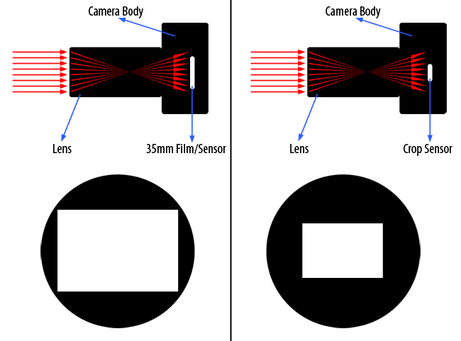
The size of the sensor will affect the image angle of view, so that a 25mm Prime lens will look different if viewed on a variety of image formats.
Thus a 25mm lens will have a mid shot when used on 35mm film (HDTV 1.78:1 16:9 aspect ratio), close up on HD Camcorders and big close up on smaller semi-professional, ‘prosumer’ camcorders such as EX-3 and Z1 etc which have 1/2″ sensors and 1/4″ sensors respectively.
This explains therefore why if you mount an HD lens onto a ½? camcorder (such as Sony PDW-F355) without an optically corrected mount, that a wide angle acts like a telephoto and why the focal lengths of wide angle lenses of ½? lenses are always smaller than those used for 2/3″ lenses.
Here is a useful sensor size chart:
For 1/3-inch CCDs: H = 4.8 mm, V = 3.6 mm
For 1/2-inch CCDs: H = 6.4 mm, V = 4.8 mm
For 2/3-inch CCDs: H = 8.8 mm, V = 6.6 mm
For 1-inch CCDs: H = 12.7 mm, V = 9.5 mm

Even though lenses are designed to work with different negative and sensor sizes, the convention is that lenses are still referred to by their focal lengths and/or also their zoom ratios in the case of zoom lenses.
A very useful trick to know is that to convert 35mm focal lengths to 2/3″, just divide by 2.5 and to convert Super16 to 2/3″, divide by 1.6.
Thus a 25mm PL mount film lens has the same field of view as a 10mm 2/3″ lens.
The same lens in Super16 has an equivalent focal length of 16mm and has the same field of view as a 10mm 2/3″ lens.

See more on vmi

Meaning and Symbolism of Colour in Storytelling

Posted in Cinema e Fotografia with tags , , , , , , on 18 agosto 2015 by realuca

Red Color  Red

Red is the color of fire and blood, so it is associated with energy, war, danger, strength, power, determination as well as passion, desire, and love.

Orange Color  Orange

Orange combines the energy of red and the happiness of yellow. It is associated with joy, sunshine, and the tropics. Orange represents enthusiasm, fascination, happiness, creativity, determination, attraction, success, encouragement, and stimulation.

Yellow Color  Yellow

Yellow is the color of sunshine. It’s associated with joy, happiness, intellect, and energy.

Green Color  Green

Green is the color of nature. It symbolizes growth, harmony, freshness, and fertility. Green has strong emotional correspondence with safety. Dark green is also commonly associated with money.

Blue Color  Blue

Blue is the color of the sky and sea. It is often associated with depth and stability. It symbolizes trust, loyalty, wisdom, confidence, intelligence, faith, truth, and heaven.

Purple combines the stability of blue and the energy of red. Purple is associated with royalty. It symbolizes power, nobility, luxury, and ambition. It conveys wealth and extravagance. Purple is associated with wisdom, dignity, independence, creativity, mystery, and magic.

White Color  White

White is associated with light, goodness, innocence, purity, and virginity. It is considered to be the color of perfection.

Black Color  Black

Black is associated with power, elegance, formality, death, evil, and mystery.

See more on color-wheel-pro

Classic color schemes s

Monochromatic Color Scheme

Monochromatic Color Scheme

The monochromatic color scheme uses variations in lightness and saturation of a single color. This scheme looks clean and elegant. Monochromatic colors go well together, producing a soothing effect. The monochromatic scheme is very easy on the eyes, especially with blue or green hues.

Analogous Color Scheme

Analogous Color Scheme

The analogous color scheme uses colors that are adjacent to each other on the color wheel. One color is used as a dominant color while others are used to enrich the scheme. The analogous scheme is similar to the monochromatic, but offers more nuances.

Complementary Color Scheme

Complementary Color Scheme

The complementary color scheme consists of two colors that are opposite each other on the color wheel. This scheme looks best when you place a warm color against a cool color, for example, red versus green-blue. This scheme is intrinsically high-contrast.

Split Complementary Color Scheme

Split Complementary Color Scheme

The split complementary scheme is a variation of the standard complementary scheme. It uses a color and the two colors adjacent to its complementary. This provides high contrast without the strong tension of the complementary scheme.

Triadic Color Scheme

Triadic Color Scheme

The triadic color scheme uses three colors equally spaced around the color wheel. This scheme is popular among artists because it offers strong visual contrast while retaining harmony and color richness. The triadic scheme is not as contrasting as the complementary scheme, but it looks more balanced and harmonious.

Tetradic (Double Complementary) Color Scheme

Tetradic (Double Complementary) Color Scheme

The tetradic (double complementary) scheme is the most varied because it uses two complementary color pairs. This scheme is hard to harmonize; if all four hues are used in equal amounts, the scheme may look unbalanced, so you should choose a color to be dominant or subdue the colors.

See more on color-wheel-pro

Three Point Lighting & the magic of Key Light

Posted in Cinema e Fotografia with tags , , , , , , , on 5 aprile 2015 by realuca

The Key Light

The key light is vital for video production lighting: it is placed about 45 degrees to the subject, either left or right, usually above and aimed down between 30 and 45-degrees. It is the dominant light. Position this light as you would if it were the only light you had. From this, you’ll have defining shadows on the face which would be lost if the light were on a similar axis to the camera, but you’ll notice that, in a room with no other lighting, it will create deep, dark shadows. Toning down those shadows is the job of the next light.

The Fill Light

The fill is usually two or three stops dimmer than the key light, and its placement is at a near 45-degree angle on the opposite side of the camera, often on a level with the subject’s face. The fill light is a reaction to the key light, and its ultimate placement depends on the function of the fill – what shadows does it create? Where do you need to reduce them for better video production lighting?

The fill light can be the same size as the key light in wattage and bulb size, but you might then place it further away than the key. Watch as the fill drives back the shadows; though the lighting is not nearly as harsh, these two together still present a very two-dimensional view. The job of the third and final light is to create a sense of distance between the subject and the background, giving an illusion of a third dimension on the screen.

The Back Light

The back light, sometimes called a rim or shoulder light, is aimed at the subject’s back, and, like the key light, it is usually 45-degrees off the axis and shines down upon the subject. This creates a bright rim around part of the subject, creating an outline which then appears to separate the shoulders from the background. The back light should be at least as bright as the key, often brighter.

See more on videomaker

Flat Lighting

Because this light is a very flattering light, flat lighting is used primarily in head shots and glamour editorial shots.

Butterfly Lighting

This lighting pattern is usually used in beauty shots when a reflector is added underneath to soften the shadows.

Loop Lighting

Because the light pattern comes from this angle, it creates a more dramatic look with a shadow that falls off the nose pointing down to one side. The subject will have more light on one side of their face. You can use this to your advantage if the subject has a “good” side or a preferred side of their face by lighting that side.

Rembrandt Lighting

Rembrandt is a stronger angle than loop lighting, making it look more dramatic. The more shadow we add to our subject and the more we turn our light away from flat lighting the more dramatic our lighting becomes. It is used heavily in all types of portrait photography including athletes. It is also the type of lighting we used in the video above!

Split Lighting

If flat and loop lighting fills in wrinkles, split lighting will exaggerate them. This lighting pattern is used a lot in athletic portraits just for that purpose. It exaggerates their muscle definition and body features.

See more on slrlounge

Curiosity of photos shows.. the dream of cinema reveals

Posted in Cinema e Fotografia with tags , , , , , , on 5 aprile 2015 by realuca

Photographers see the world differently. On road trips we see ‘stop the car now’ moments that would never draw attention from 99.999% of the population. On a nature walk, we go from standing to laying horizontal on the ground. At airports, in buildings, we notice chairs, patterns and lines. We see literally and abstractly. We see character in peoples faces, wildlife emotion, beautiful bokeh, color, with perspectives that cross the gamut. We see in color and black and white. Photography is a way of observing, absorbing and forever (thanks to digital and photograph restoration) storing a moment.

  • Happiness
  • Feeding the Addiction
  • Solitude
  • “I wish I could do something”
  • Explore
  • Thinking
  • Noticing Details
  • Happy Bubble

See more on lightstalking

“Hey, are you a dreamer? I haven’t seen too many around lately. Things have been tough lately for dreamers. They say dreaming is dead, no one does it anymore. It’s not dead it’s just that it’s been forgotten, removed from our language. Nobody teaches it so nobody knows it exists. The dreamer is banished to obscurity. Well, I’m trying to change all that, and I hope you are too. By dreaming, every day. Dreaming with our hands and dreaming with our minds. Our planet is facing the greatest problems it’s ever faced, ever. So whatever you do, don’t be bored, this is absolutely the most exciting time we could have possibly hoped to be alive. And things are just starting.”

See more on nofilmschool